Amber at a Crossroads
Clarifying a photography brand that had lost direction.
The Challenge
Amber had strong photography skills and a growing portfolio, but her branding lacked consistency and clear positioning. The business no longer reflected the level of professionalism and emotional connection she wanted clients to experience.
The Direction
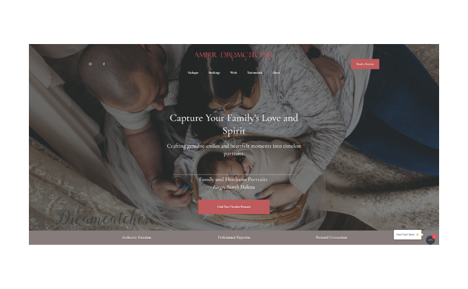
We clarified the brand around heirloom-style photography, emotional storytelling, and timeless family connection.
The Identity
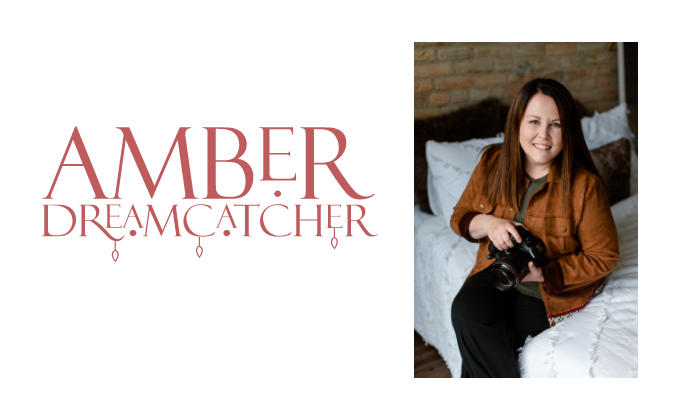
The final identity combined soft typography, warm neutrals, and dreamlike visual elements to create a brand that felt artistic, personal, and emotionally grounded.
The Outcome
The refreshed branding gave Amber a clearer visual identity, more confidence in her positioning, and a stronger foundation for attracting aligned photography clients.